How to align or rotate chart titles in Excel
Sometimes happens that the chart titles are not good visible. So we have to align or rotate them. Continue reading “How to align or rotate chart titles in Excel” »
Sometimes happens that the chart titles are not good visible. So we have to align or rotate them. Continue reading “How to align or rotate chart titles in Excel” »
People often ask: Should I use the line or the scatter? In this article, I try to explain the difference and when to use each chart type. Continue reading “The difference between a line chart and a scatter chart” »
In this example, I will show you how to combine column chart with line chart. For the rest of chart types is the same procedure. Continue reading “Two different chart types in one graph” »
Pareto principle is formulated as: 80% of the consequences (eg profit or number of rejects) comes from 20% of causes. It can be used in different sectors of human activity (eg, economy, quality of production). We will construct a graph that will show us the major causes. Continue reading “Pareto Analysis in Excel (part 1)” »
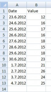
The table in this example shows dates and values. There is a missing dates. It causes a big blank space in the chart. Continue reading “Missing date in the chart” »
Chart created from a simple data table is static and when the source changes, the chart has to be update manually. There is a possibility how to update the chart automatically. Table on the following picture is the source of the chart.
The chart can be simple like this:
Continue reading “Chart: Automatic update when data source changes” »
Let’s have a list of some values. The values are taken every day. The task is to create chart showing only last 5 days from today. Charts must be updated automatically.
Important: I wrote this on 4.7.2012, so for this example is 4.7.2012 the current date.

Continue reading “Automatic change in the chart according to the current date” »
Excel does not support conditional formatting in charts, but we can solve it with a little trick. Original data will be split into a new table and then will be displayed by Stacked Column chart. The result will look like conditional formatting.
Let us have following data table. We want to highlight a column in chart having a value less than 20.
Simple chart for this table looks like this:
How to automatically highlight columns? Continue reading “Conditional Formatting in column (bar) charts” »
In this example we have data from some water pump. We were observed 2 variables (kW and water volume). So there are two data series measured in time, but in different time intervals. First measurement started at 10:00 and continued at 5 minute intervals (left table). Second measurement started at 10:13:30 and continued at half minute intervals (right table). We want Excel to show relationship between these two data series in one chart.
How to show these tables in one chart? Solution
Copyright © All Rights Reserved · Green Hope Theme by Sivan & schiy · Proudly powered by WordPress