Two tables with common column displayed in one chart
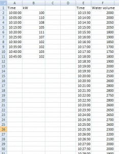
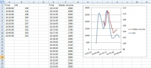
In this example we have data from some water pump. We were observed 2 variables (kW and water volume). So there are two data series measured in time, but in different time intervals. First measurement started at 10:00 and continued at 5 minute intervals (left table). Second measurement started at 10:13:30 and continued at half minute intervals (right table). We want Excel to show relationship between these two data series in one chart.
How to show these tables in one chart?
Solution
Step 1
Make a XY Scatter chart with smooth lines. Data source is table one (A1:B11).

Step 2
Add new data series into this chart.
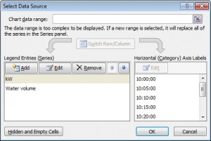
Go to the Chart Tools (Options), choose Select Data
and then choose button “Add” to add new series (Legend Entries).
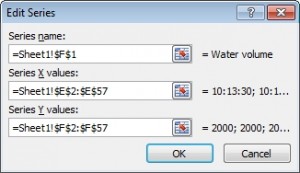
Now you must edit series window.
The first item (Series name) is cell “Water volume”, the second item (Series X values) is column with time and the third item (Series Y values) is column with volume values.
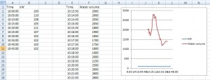
Now we have two data series in one chart.
This is not very useful view. Both of data series share one Y-axis. In the next step we split them into two Y-axes.
Step 3
Right click on one of the data series (line) and choose “Format data series”.
Now switch “Plot Series On” to Secondary Axis.

Excel adds another Y-axis to the chart. Now you can see the relationship between data. Values from the first table are on the right Y-axis and the line of them is blue. Values from the second table are on the left Y-axis and the line is red.
Watch this in video




wanted to combine below 2 tables into one chart
Date 28-Nov-20
Program IN Closed WIP Auto Manual
G2G 32 39 1 10 21
R2O 10 10 0 10 0
HyperWan 7 7 0 7 0
SDWan 0 0 0 0 0
Monarch 0 0 0 0 0
Date 5-Dec-20
Program IN Closed WIP Auto Manual
G2G 132 106 2 45 89
R2O 11 11 0 11 0
HyperWan 28 28 0 28 0
SDWan 0 0 0 0 0
Monarch 0 0 0 0 0
I have 3 tables with shared data. What is the procedure for that?
I need 3 axis in one graph. Is it possible?
How can I design the graph when I have multiple data tables (2 and more)? It should be one graph with all data together.
How to create Excel chart when tables are sharing one column. Nice and simple solution. It was always big issue for me. I have 2 data tables and I want to join tables into one chart in Excel.