Conditional Formatting in column (bar) charts
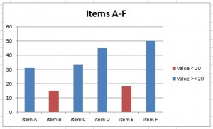
Excel does not support conditional formatting in charts, but we can solve it with a little trick. Original data will be split into a new table and then will be displayed by Stacked Column chart. The result will look like conditional formatting.
Example
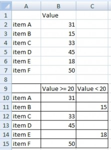
Let us have following data table. We want to highlight a column in chart having a value less than 20.
Simple chart for this table looks like this:
How to automatically highlight columns?
Solution
Step 1
Make a new table having values in 2 columns. In the first are values greater than or equal to 20. In the second column are the rest (values less than 20).
Formulas for item A:
Cell B10: =IF(B2>=20,B2,"")
Cell C10: =IF(B2<20,B2,"")
Step 2
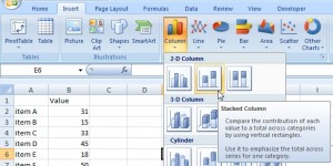
Create stacked column chart from source A9:C15. Result is working like a column chart with conditional formatting.
And the final result:
Watch this in video tutorial:


The problem with using stacked charts is that when you have a dynamic chart with different scenarios, the labels keep running all over the place.. or am I missing something? :/
Very helpful, thank you!
I’m trying to graph 3 numbers with 3 colors in a stacked 3d bargraph. I’m having trouble with the top-most number when it is zero (or blank). When non-zero, the color of top of the bar is correctly represented. However when the top-most number IS zero, the top of the bar is shown in the color of the zero value (instead of the non-zero value immediately beneath). Any help is much appreciated.
Hi,
I assume that you are using the same structure with IF function as it is presented here. It sounds that there is something wrong in the range endpoints. You have to check your >= and < operators. You can try to change them to > and <=. Position of the equals operator is very important for the end point.
How can I connect it with pivot table chart?
Do you know if Microsoft made some progress in graph with conditional formatting? Do I need to buy new Excel version? This solution is ok but I want more conditions and cases. For big tables is it very compicated.
IMHO There is no better solution than this. I tried to find this feature in Excel ribbon but there is non.
Sometimes the most beautiful answers are the most simple. Thank you!
Hi,
how can I create colored chart in Excel 2016? I want to have different data curve displayed by different colors. How to set this option to chart settings?
Hi,
I think this example should also work in Excel 2016.
This solution is great for Excel chart where color is depending on value.
How to dynamically change color in chart? I want to create chart from values and make colors depending on values.
Hi,
Excel does not support conditional formatting in charts. But there is a solution. Read this article. You have there examples. If you have some specific issue we can help you.
Can you show us an example for conditional formatting in chart with multiple conditions? Can I use the temp table for this?
It is simillar as for 2 conditions. You have to sort data into columns a create chart from them.
How to change color in chart using Conditional formatting in Excel file?
Is there somewhere more solutions like that? This is really great idea for chart conditional formatting. I want to create my own Excel hints database.
Can I somewhere download this example in Excel format?
Really simple and easy solution of conditional formatting in Excel graph.
Thank you.
The new XRumer 16.0 – revolution in online promotion:
artificial intelligence will help you to attract customers so effectively,
more than ever!
Hello)
XRumer16.0 is coming soon
Good luck!
humans