The difference between a line chart and a scatter chart

People often ask: Should I use the line or the scatter? In this article, I try to explain the difference and when to use each chart type. Continue reading “The difference between a line chart and a scatter chart” »
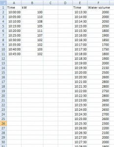
Two tables with common column displayed in one chart

In this example we have data from some water pump. We were observed 2 variables (kW and water volume). So there are two data series measured in time, but in different time intervals. First measurement started at 10:00 and continued at 5 minute intervals (left table). Second measurement started at 10:13:30 and continued at half minute intervals (right table). We want Excel to show relationship between these two data series in one chart.

Tables with data series

How to show these tables in one chart? Solution

Copyright © All Rights Reserved · Green Hope Theme by Sivan & schiy · Proudly powered by WordPress