Pareto Analysis in Excel (part 1)
Pareto principle is formulated as: 80% of the consequences (eg profit or number of rejects) comes from 20% of causes. It can be used in different sectors of human activity (eg, economy, quality of production). We will construct a graph that will show us the major causes.
Example 1
We are looking for the most common item. There are items A, B, C, D, E, F. Items can represent errors, accidents, cases,… Following table presents a list of items for the selected period. 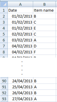 This is only a small part of the table. The original table has range A1:B93.
Step 1
Create a table with the frequency of items (frequency of occurrence). You can use COUNTIF function. 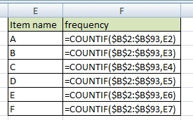
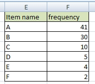
If it is necessary, sort the table by frequency (from largest to smallest).
Step 2
Add a cumulative percentage column to the table.
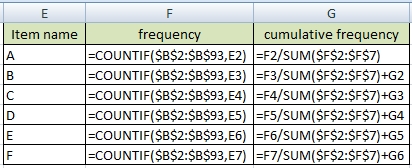
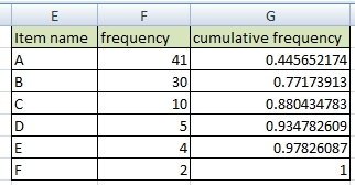
Display cumulative numbers as percentages. This is the final Pareto table. 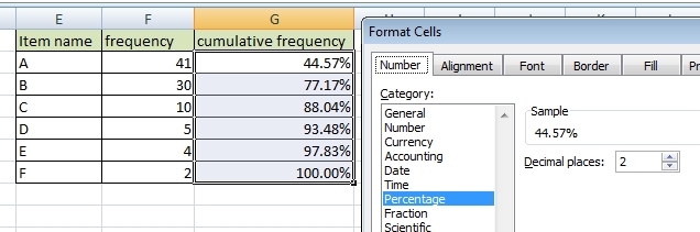
Step 3 / create Pareto chart
Create a column chart.
Change cumulative frequency data series type to Line: Right-click >> Change Series Chart Type >> Line. 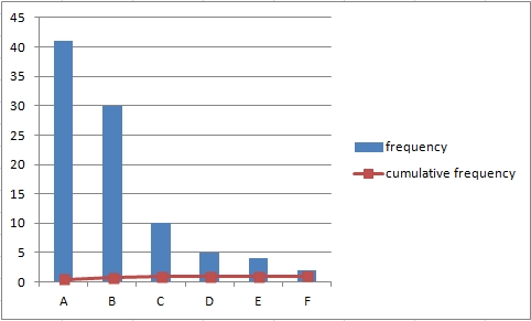
Set series option to Secondary Axis: Right-click >> Format Data Series >> Secondary Axis. The line you will see is sometimes called Lorenz curve. 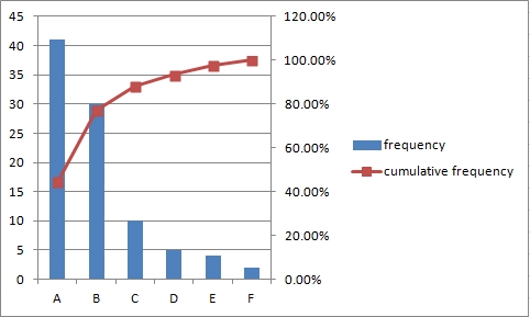
Add data labels to the cumulative frequency line: Right-click >> Add Data Labels. 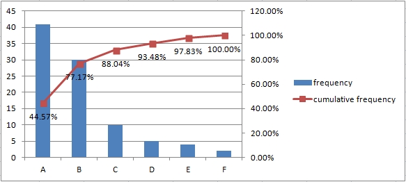
Example 2
Items can have different importance. So we have to calculate with weight of item. Let’s use the previous table.
Step 1
Create a table with the frequency of items (frequency of occurrence) and add weight of items. 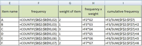
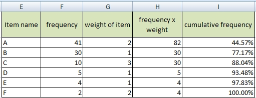 Other procedures are the same as in the previous example.
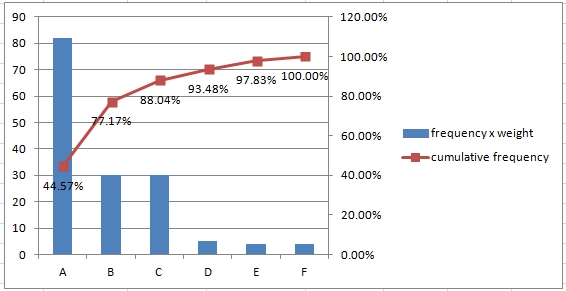
Step 2 / create Pareto chart
Create chart from the table. Select columns: Item name, frequency x weight and cumulative frequency.
Very useful
Hi,
how can be this pareto chart created in excel exported into database?
It dependes what kind of database do you mean. SQL, MS Access, Oracle or some simple CSV?
Do you even know what is Pareto? I will answer you:
Pareto diagram or pareto combines a bar graph and a line graph. The bars show the frequency of each category, sorted by size from the largest to the smallest, and the line graph then shows the cumulative frequency of the categories below.
Am I crazy or what?
No you are not 🙂
Pareto rule 80/20 works in real life very well. I work in financial department of a big company and I see examples of it every times in such a different topics.
Solved! I want Pareto graph into my thesis. It was economical and statistical analyze of big data. Pareto principle make the right results. Great example. Thank you
How to create simple Pareto chart in Excel. Nice solution, thank you. I need Pareto Analysis also in Libre Office. Is it the same as in Excel?