Two different chart types in one graph
In this example, I will show you how to combine column chart with line chart. For the rest of chart types is the same procedure.
Example 1
In the table there are some measured and expected values. The task is to display the measured values as a column chart and the expected values as a line chart.
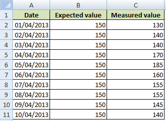
Create the column chart from the entire table. Right-click on the Expected value data series and choose the Line Chart.
Result

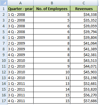
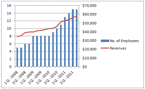
Example 2
We want to determine the relationship between number of employees and revenues. No. of Employees will be a Column chart and revenues will be a Line chart.
Step 1 / change chart type
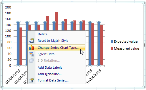
Create the column chart from the entire table. If values in a both columns are similar, you see two data series. In this case is Revenues much bigger than No. of Employees, so you see only one data series. Right-click on the chart and select Change Series Chart Type…. Choose the Line chart and confirm.


Step 2 / use Secondary Axis
Go to the: Right-click >> Format Data Series… >> Series Options and select the Secondary Axis.
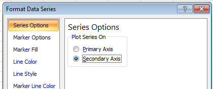
The final chart has 2 Vertical Axis. Line chart values are on the left and column chart values are on the right.
Result
I have 3 tables and I want them into one chart. This chart type can display two different data series. Is there any solution for my problem?
Thank you in advance.
Thank you!
Thank you very much for this example. It solves our problem with charts.